On a swatch, two colors that go together are easy to spot. On a video, it's another story: your title lands on a bright sky, a face or a moving shot, and the nice palette becomes unreadable.
For years, I made my palettes on Adobe Color or Coolors: two or three colors, sometimes four or five when I needed them. Then I copied each code by hand into each Text+. To keep track, I took screenshots of my palettes and stored them in my bins (it got messy fast). And as soon as a color changed, I had to go back to the website, generate a new palette and go through every title again.
Even with a well-oiled routine, I was always a bit worried the client would change a color at the last minute. So I asked them to approve their colors before I started editing. Except that when they see the edit, clients often think "I'd have liked this title in another color" or "this box with another background". Locking the colors before the edit held them back. Today, with the plugin I ended up building (more on it at the end), I tell them right away that everything can still be changed once the edit is done, and the conversation is much lighter.
In this article, we start with the basics (the color wheel, complementary colors, the 60-30-10 rule), then move on to what interior design guides leave out: checking that your colors read on the image. And finally, how to apply them to your titles in DaVinci Resolve.
The color wheel in two minutes
The color wheel puts colors in a circle, in rainbow order. Every rule for finding colors that go together reads off it: you look at where the colors sit relative to each other.
There are two versions, and that's often where people get confused:
- The painter's wheel (red, yellow and blue as primaries, often called the RYB color wheel): the one from school. The complement of blue there is orange.
- The screen wheel (red, green and blue, the RGB colors of light): the one in your software, from DaVinci Resolve to Photoshop. The complement of blue there is yellow.
For a video, the screen wheel is the one that counts: your title is made of light, not pigment. Both give combinations that work, but if a tool suggests yellow with your blue when you expected orange, now you know why.
Color combinations that go together
2 colors that go together: complementary colors
Complementary colors sit opposite each other on the color wheel. On screen: blue and yellow, red and cyan, green and magenta. They're the pairs with the strongest hue contrast: they catch the eye right away.
They're perfect for a word you want to stand out, an arrow, a subscribe button. Used in equal amounts, though, two saturated complements fight each other and tire the eyes. Keep one for the background or main color, and the other as a small touch.
3 colors that go together: analogous, triadic and split complementary
Analogous colors are neighbors on the wheel: blue, blue-green and green, for example. They always go together because they look alike. It's the calmest combination, great for a quiet video, a documentary, an understated brand. Its weak point: little contrast, so a title in a color close to the background reads poorly.
A triad takes three colors evenly spaced on the wheel (a triangle). Livelier than analogous colors, more balanced than a complementary pair. It works well for colorful YouTube videos, as long as you pick one dominant color and tone down the other two.
Split complementary colors are a good middle ground: one color, then the two neighbors of its complement. You keep the contrast, with less tension.
A full color palette: the 60-30-10 rule
A palette of four or five colors isn't used in equal parts. The 60-30-10 rule, borrowed from interior design, gives the proportions:
- 60% for the dominant color: often a neutral (off-white, dark gray, midnight blue) for backgrounds and title cards.
- 30% for the secondary color: your main titles, banners.
- 10% for the accent color: an underlined word, an icon, a call to action.
In video, the image itself often takes the 60%. Your colors share the remaining 40%: one title color and one accent are enough most of the time.
Colors that go together, but read on the image
All the rules above are about harmony. None of them tells you whether your title reads. And in video, the background changes with every shot.
What counts for reading is brightness contrast between the text and what's behind it. Web accessibility guidelines (WCAG) measure it as a ratio: at least 4.5:1 for regular text, 3:1 for a large title. Pure white on pure black is 21:1. White on a bright sky is barely above 1:1: your title disappears, however nice the color.
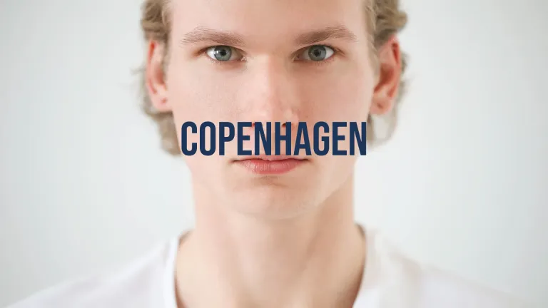
A real example: here, a white title on a light face. White goes with everything, except this shot. The navy blue from the same brand kit reads with no outline needed.
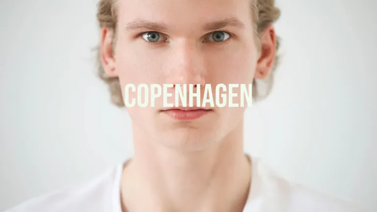
Three reflexes when a title is hard to read:
- Switch to another color from your palette before adding an effect. A darker or lighter color from the same brand kit is often enough.
- Add an outline or a shadow if you have to keep the color (brand kit imposed by a client).
- Put a bar behind the text when the shot is too busy.
Outlines, shadows and bars are done in Fusion or with Text+: I show them in 7 text effects you need to know in DaVinci Resolve. For the fonts that go with your colors, see the best fonts for titles in DaVinci Resolve.
Finding your colors from an image or a brand kit
You don't have to start from scratch. Three starting points work well:
- The client's brand kit: the colors are set, your job is to choose which one goes on which shot.
- A frame from the video: take the dominant color of a key shot (a sky, a piece of clothing, a set) and build the palette around it, with analogous colors for a soft video or its complement for punch.
- A palette generator like Coolors or Adobe Color: handy for exploring, but you then have to copy the codes into every title, and nothing tells you whether they read on your shots.
Keep the hex codes (#1d3557, for example) somewhere: that's what you'll type into DaVinci Resolve.
Applying your color palette in DaVinci Resolve
By hand, with Text+
In the Edit page, select your Text+ title, open the Inspector, then the text color (Color). Paste your hex code in the color picker, or pick the color. Do the same for the outline and shadow if needed. To reuse the same settings, save the title as a preset or paste its attributes onto the other clips.
That works fine for three titles. For forty, or when the client changes their color at the last minute, it takes a while.
With Palette, without leaving DaVinci Resolve
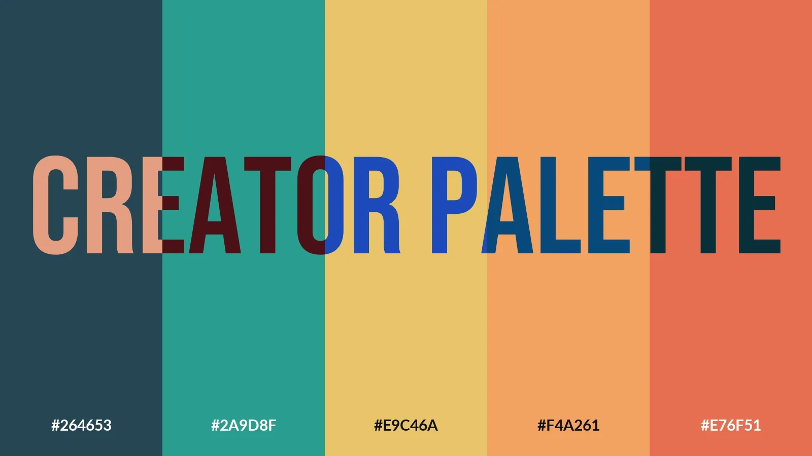
That's why I made Creator Palette, a panel that opens next to your timeline. It suggests colors that go together (with a lock on the ones you keep), measures whether the title reads on the shot behind it, and applies the color in one click. One button checks every title in the timeline at once and puts a marker on the ones that are hard to read. And if the client changes their color, Palette replaces it across the whole timeline.
Animating your titles with Creator Composer? Palette also sets the colors and fonts of Composer titles, text by text: your titles move and stay on brand.
Palette requires DaVinci Resolve Studio, and you can try it free for 7 days.
FAQ
What are complementary colors?
Two colors opposite each other on the color wheel. On screen: blue and yellow, red and cyan, green and magenta. In painting: blue and orange, red and green, yellow and purple.
What is the complementary color of blue?
Yellow on screen, orange in painting. For a calmer feel, pair blue with its neighbors (blue-green, purple) instead. For a title on a dark blue background, off-white or light yellow read very well.
What is the complementary color of green?
Magenta on screen, red in painting. Saturated green and magenta in equal amounts vibrate to the eye: keep one of them as a small touch.
How many colors should I use in a video?
Two or three for titles and graphics are enough: a main color, a secondary one and an accent. The image already brings plenty of color.
Does white go with every color?
For harmony, yes. For readability, no: a white title disappears on a sky, light skin or a white wall. Check each shot, or add an outline.
How do I know if a title is readable?
Measure the contrast between the text and the image behind it: at least 4.5:1 for regular text, 3:1 for a large title. In DaVinci Resolve, Palette does this measurement letter by letter on the shot.